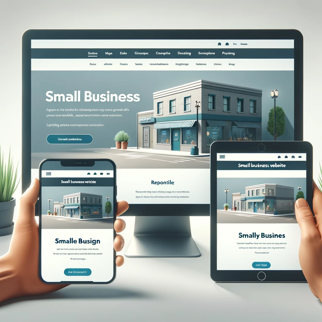
In today’s digital age, having a mobile-friendly design for small business websites is more crucial than ever. With the increasing use of smartphones and tablets, ensuring your website is optimized for mobile devices can significantly impact your business’s success. This article delves into why mobile-friendly design is essential and how to implement it effectively.
Why Mobile-Friendly Design Matters
A mobile-friendly design for small business websites is vital for several reasons:
- Increased Mobile Usage: With more people using mobile devices to browse the internet, having a mobile-friendly website ensures you reach a broader audience.
- Improved User Experience: A mobile-friendly design provides a seamless browsing experience, reducing bounce rates and increasing the time users spend on your site.
- Higher Search Engine Rankings: Search engines like Google prioritize mobile-friendly websites in their search results, enhancing your visibility.
- Enhanced Brand Image: A well-designed mobile site reflects positively on your brand, building trust and credibility with your audience.
1. Responsive Web Design
Responsive web design is the foundation of a mobile-friendly website. It involves creating a flexible layout that adjusts to different screen sizes and orientations. Using fluid grids, flexible images, and CSS media queries, you can ensure your website looks great on any device.
Learn more about responsive web design.
2. Optimize Page Load Speed
Page load speed is critical for mobile users who may have slower internet connections. To optimize load speed, minimize the use of large images and videos, leverage browser caching, and use a content delivery network (CDN). Fast-loading pages improve user experience and can positively impact your search engine rankings.
Google PageSpeed Insights is a useful tool for analyzing and improving your page load speed.
3. Simplify Navigation
Mobile users need to find information quickly. Simplify navigation by using a clean and intuitive menu structure, incorporating a search function, and ensuring important links are easily accessible. Consider using a hamburger menu to save space and keep the design clean.
4. Touch-Friendly Design
Design your website with touch interactions in mind. Ensure buttons are large enough to tap easily, avoid small links that are hard to click, and provide ample spacing between interactive elements. This enhances usability and reduces user frustration.
5. Use Readable Fonts
Text readability is crucial on smaller screens. Use a legible font size (at least 14px) and choose fonts that are easy to read. Ensure sufficient contrast between the text and background to improve visibility, especially in different lighting conditions.
6. Optimize Images and Media
Images and media should be optimized for mobile devices to prevent slow load times. Use responsive images that adjust to different screen sizes, compress images to reduce file size, and use modern formats like WebP for better compression and quality.
Image Compressor is a handy tool for optimizing images for the web.
7. Implement Mobile-Friendly Forms
Forms are essential for lead generation, but they can be cumbersome on mobile devices. Simplify forms by using fewer fields, enabling auto-complete, and ensuring fields are large enough to tap. Consider using mobile-specific input types like date pickers and dropdowns to enhance usability.
8. Test Across Devices
Regularly test your website on various devices and browsers to ensure consistent performance and appearance. Use tools like BrowserStack or Google’s Mobile-Friendly Test to identify and fix issues across different platforms.
Google’s Mobile-Friendly Test is an excellent resource for evaluating your website’s mobile compatibility.
9. Prioritize Core Web Vitals
Core Web Vitals are a set of metrics that measure user experience on your website. Focus on improving metrics like Largest Contentful Paint (LCP), First Input Delay (FID), and Cumulative Layout Shift (CLS) to enhance performance and user satisfaction on mobile devices.
10. Continuously Update and Improve
Mobile technology and user expectations are constantly evolving. Regularly update your website to incorporate new features, fix bugs, and improve performance. Staying proactive in optimizing your mobile-friendly design ensures your website remains relevant and effective.
By implementing these strategies, you can create a mobile-friendly design for small business websites that enhances user experience, boosts search engine rankings, and drives more traffic to your site. For more tips on building a successful website, visit the Outdriver homepage.


0 comentarios